The Ultimate Guide To Data Visualizations For Marketers
There’s no doubt that marketing is evolving as technologies are evolving.
And as a marketer, every decision and move has to be backed up by appealing data with these ever-changing technologies.
But the problem is you can pick and choose from a ton of data points— sometimes, there are too many!
For instance, you can pick from website analytics, sales figures, software performance, market research, customer data, and campaign stats.
It’s like staring into a black hole… The possibilities are endless.
All these terms can be confusing, especially when you need to dig deep and analyze before making a significant decision.
The solution? Data visualization.
The goal of data visualization is to resolve this problem by presenting your data in a visual format. Without easy-to-see data visualization strategies, your marketing efforts are going to be bland.
And your audience is gonna have a bad time.
So try out these strategies to up your visualization game.
What is data visualization?
Data visualization can be defined as the visual display of data. It uncovers trends, patterns, outliers, as well as correlations in your marketing data.
Data visualizations can also help you understand what your data means before taking any marketing or business decision. This is especially important in digital marketing where a variety of sources can gather visitor metrics quickly.
Don’t have a clue what advertising solution to buy into before engaging in product promotion? Try extracting your existing marketing campaign reports.
You can then plot a chart that compares the potentialities of different platforms. This will guide you in absorbing the data and making informed decisions.
You can also tell stories with your data visually by creating heatmaps, using pie charts, line charts, bar charts, bubble charts, timelines, word clouds, and scatter plots.
If you need more help understanding data visualization, I recommend giving Visme’s 3-step data visualization a read.
So now that you’ve got a taste of data visualization, let’s dive deeper into how to use these applications and why they are relevant to your marketing efforts.
What are the different types of data visualization?
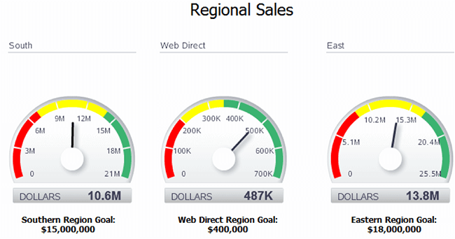
1. Indicators depicting on KPI
Want to present a quick idea of the performance of your marketing effort on a particular KPI? Or maybe you don’t know what KPIs and sales metrics to look out for— in that case, I recommend checking out Inside Intercom’s guide on the best KPI metrics for B2B sales teams.
Try using indicators for your data visualization needs. Integrating ’a gauge indicator‘ visualization, for instance, lets you know if you’re working below or above target instantly.
It’ll be even easier if you include color coding such as red/green or up/down pointers. You can even create custom visuals and indicators to provide a compelling story that grabs attention.
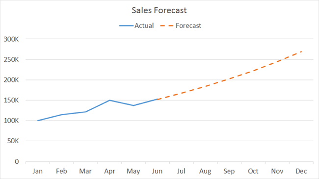
2. Line charts for showcasing trends
You can try using line charts to show an entire trend swiftly and concisely.
Line charts are cool because they are easily interpreted and they’re useful in explaining trends for several categories over a time frame.
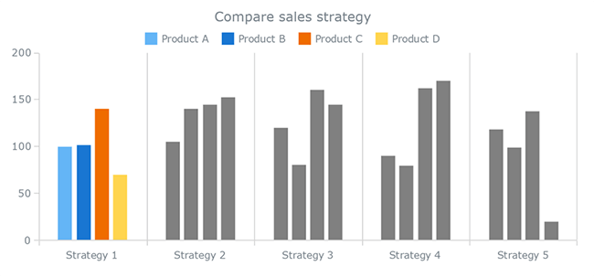
3. Column charts to compare values
Coming after line charts are a similar chart— column charts.
Typically, you should utilize column charts in the comparison of different values side-by-side. You can also utilize them to reveal changes over time.
If you want to draw attention to the overall figures instead of trend shape, use column charts.
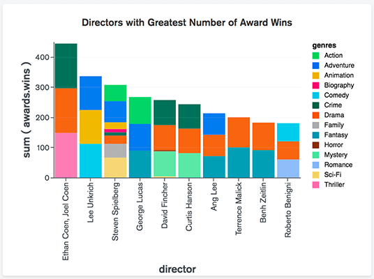
4. Bar charts for breaking down items
Here’s another different but similar type of chart. If you want to compare many different values, especially when you have already broken them into color-coded sections, you can use bar charts.
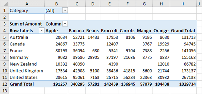
5. Use pivot tables to present important figures
Pivot tables certainly aren’t the most intuitive or sexy means of visualizing data, but they can be handy when it comes to extracting some key numbers while seeing exact figures— especially if you cannot access automation tools.
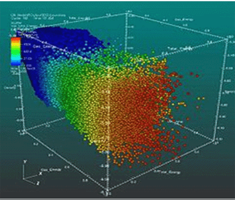
6. Use dispersed charts to show distribution and relationships
Next up’s dispersed charts. These type of charts display data sections by circle color and the data volume by the size of the circle. You can visualize the relationship between and the distribution of two variables.
7. Use bubble charts for an easy-to-view Chart for multiple variables
Bubble charts are similar to scatter charts, but have their own flavor of awesomeness. They showcase the weight of values by the circumference size of the circle. They’re also different because they jam-pack several unique values into a small location and only depict a sole measurement per section.
Bubble charts are relevant when you intend to showcase how several sections are important compared to irrelevant ones. With bubble charts, you can focus on the most significant issues or successes without stress.
8. Treemaps showcase hierarchies when comparing values
No, I’m not talking about actual trees (although that would be pretty rad). Treemaps are used to display hierarchies and compare values between subcategories and categories.
You can also retain information while presenting a quick sense of which aspects are relevant in the big picture.
You can take this a step further by using color-coded rectangles for different values, with the weight of the values reflecting their proportion of the whole.
9. Polar charts show relationships between several variables
A polar chart, also called a polar area diagram, is a type of pie chart. And no, polar charts aren’t cold. But they are really cool.
All sections of the pie have equal angles, and the value is depicted by the distance it extends from the circle’s center.
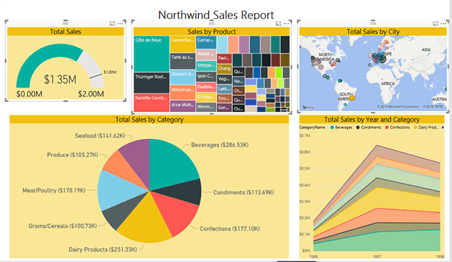
10. Area/ dispersed maps show geographical data
This type of data visualization can help you see instantly which cities or locations are relevant to your business. The data is visualized as dots of color on a map while the circle size represents the values.
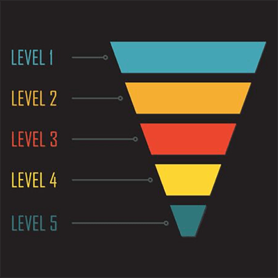
11. Funnel charts are useful for displaying a pipeline for sales figures
Funnel charts are attractive not only because of their name.
They are useful in showing the decreasing values as clients journey through your sales funnel. Funnel charts make your conversation rates come alive at each step. This can enable you to detect where buyers are exiting each step through the funnel.
What are the 4 benefits of data visualization in marketing?
Benefit #1: It showcases trends and patterns
Which location possesses a better lead to conversion rate? Which of the days attracts more prospects? Which of the pages is the most visited?
Any efficient marketer will look for trends as well as patterns to discover opportunities. With raw data, you’ll only get numbers. But when you show your data visually, you can easily spot patterns, correlations, and design trends in the data.
Benefit #2: Data visualization breaks up complex data
Humans are visual beings. It is even said that 93% of our communication is visual. You can hardly find anyone going through spreadsheets with several numbers who will not end up zapped of their mental energy.
Interestingly, your audience only needs relevant information that answers their questions with no stress. Precisely, they need actionable insights instead of a myriad of data with no actionable steps. With data visualization, you can easily simplify your complex spreadsheets into digestible information.
Benefit #3: It portrays data in a purposeful manner
Data visualization can help you present your case by portraying arguments with visuals that support your story. Visuals aid comprehension and retention of information by avoiding content overload issues.
So if you don’t want to bore the board of executives at the next budget presentation, influence them by driving your points home with visuals.
Benefit #4: Express insights in a useful manner with data visualization
Customers are already bored with data overload. You can be exceptional by leveraging visual content to tell your stories.
For instance, you can use infographics to communicate insights in a comprehensive and easily shareable format.
What are the best ways to use data visualization?
When done right, data visualization can work out great. Data visualization enables you to combine your research-backed results with excellent visual design that will keep your audience engaged.
For data visualization to help you see what you normally wouldn’t by just examining the data source, it must incorporate these three things: data analysis, storytelling, and design.
#1: Data analysis
You can uncover stories that are relevant and exciting during analysis. Most analyses depend on patterns and relationships.
#2: Patterns
Patterns exist in climate, the stock market, fashion, food, and lifestyle.
Patterns enable us to forecast what will happen in the future and position us to be better prepared.
A meaningful data analysis dissects data in different ways in search of patterns that reoccur over a timeframe, between categories and across spaces.
When you explore data this way, you can predict if your customers will buy again or exit the funnel.
#3: Relationships
Finding relationships in data is simply about finding correlations.
For example, do we sell more products when we offer more discounts?
To achieve meaningful and result-oriented data visualization, you must invest in a quality data analysis.
#4: Storytelling with data
Along with the right data analysis, you must be able to tell a remarkable story with your data that’s both convincing and speaks deeply to your audience.
And the key to a good story? Communication.
Communication is an integral part of data visualization. You may want to communicate a point of view, reports, or share a piece of new information.
You must be able to tell a compelling story that connects with the objects, places, and people that the data represents. Without your data making an emotional, cultural, or social connection, it’ll lack that oomph and be meaningless.
Data visualization must factor in the who, what, when, where, and how of the data. Your audience must own the story. A meaningful data visualization communicates to the audience, leveraging ideas and words they understand.
#5: Bespoke design
Alright, so we’ve got data visualization and storytelling covered. Next is design. Everyone who relates to your data must understand what it represents.
Therefore, good visualizations must include best practices such as visual cues, hierarchy, negative space, and annotation.
The 5 best tools for data visualization
Alright, so I threw down some data visualization knowledge at you. But now what?
It’s time to take a look at the best tools to make your data visualization dreams a reality.
These tools can help you appreciate large data sets and adequately utilize the data to implement data-based decisions, which in turn can greatly enhance your productivity.
Here are some tools you need to consider:
1. Tableau
Tableau is the captain of data visualization tools. That’s because it’s easy to use and enhances intuitive and adequate visualizations.
You can comprehend data faster with tree diagrams, word clouds, bubble charts, and treemaps, all of which provide contextual details.
Tableau also includes features such as data blending, which you can use to perform real-time collaboration. You can also share your reports or publish by providing a link for anyone to access.
2. Qlikview
If Tableau is the captain of data visualization, Qlikview is the right-hand man. Use Qlikview if you are searching for features such as advanced data visualization features, analytics, corporate reporting capabilities, powerful BI, and a clean UI.
You can also navigate and discover data as it manages and manipulates the associations of data.
Another awesome feature is that it’s possible to store and enable several users access to your data at the same time. This gives room for faster queries.
3. FusionCharts
Next up’s FusionCharts. This tool allows you to directly plug in your data to live templates, saving you a lot of time (compared to doing it from scratch).
FusionCharts is built on JavaScript API, so you can easily sync with JavaScript Frameworks. It also comes with plugins for common libraries (jQuery) which are open-source, languages (PHP & ASP.NET), and frameworks (AngularJS & React).
FusionCharts provides over 90 charts as well as over a thousand maps, which you can use to customize and manipulate the behaviors of your charts. It also provides features such as chart rendering, data loading, and a host of other benefits.
4. HighCharts
HighCharts is a hub to perform quick and straight-to-the-point visualizations. You can design interactive charts, online charts, maps, and timeline charts. Oh yeah, and it’s free-to-use for non-commercial purposes. Win-win!
Plus, anyone can see and run the interactive visualizations with its cross-browser support feature.
5. Prezi
Prezi is a presentation tool that gives you the opportunity to create several appealing formats to improve communications and brand engagement.
If you’re looking to showcase your data in a storytelling format, Prezi lets you do just that.
And who doesn’t like stories?
Data visualization: The greatest thing since sliced bread?
Data visualization affords you the privilege of communicating complex data in a simplified and visual format. The fundamental behind this is to focus on narration, data visualization, and, most importantly, your audience.
And with data visualization, you’ll be able to take your boring, old statistics and change them to something people can easily digest.
If you’re looking to level up your data game, consider using data visualizations.
Related Reading: