30 Must-Follow Landing Page Best Practices To Double Your Conversions
If you want to increase your conversions, what landing page best practices should you follow?
The answer will change depending on who you ask. Writers will tell you that good landing page copy is all that matters. Designers will ask you to focus on the design experience. And marketers will ask you to make sure that you’re collecting all the right data & optimizing the landing page for SEO.
The truth?
They’re all right.
A landing page is an intense distillation of multiple marketing fields. It’s where great copy, solid design, clever marketing, and strong data practices come together to drive visitors to a single goal.
But because there are so many moving parts to a good landing page, creating one can seem impossibly daunting. What should you focus on? What should you ignore? What are some “must-follow” landing page best practices?
I’ll answer all these questions in this detailed guide. You’ll learn the fundamentals you’ll need to create a high-converting landing page, the frameworks to adopt to alter your “landing page thinking”, and finally, we’ll cover the landing page best practices you need to follow for landing page optimization.
This landing page best practices guide is divided into six sections. Click the icons below to jump to the right section.

Landing page psychology
All landing pages are essentially an exercise in psychology. Think of a page that shows a testimonial from a prominent celebrity. Or one that proudly shares the product’s 5-star rating on Amazon.
These might be common landing page best practices, but they’re essentially rooted in the psychology of persuasion. So, understanding psychology, is crucial for creating landing pages that convert. Think of it as the strategic sauce that ties all your landing page tactics together.
Let’s look at some core psychological principles and how they’re used in landing pages below.
1. Drive customer action with scarcity
One of the core principles of persuasion is scarcity. From vintage cars to precious metals, we tend to value things that are available in limited supply. It doesn’t necessarily matter whether this scarcity is real or artificial (diamonds are a good example). On landing pages, scarcity serves two purposes:
- It shows that a product is in high demand (otherwise why would it be available in limited supply?)
- It motivates users to take action
There are plenty of ways to show this scarcity. One tactic is to show the number of currently available items – common on eCommerce stores as, here is an example from Andertons Music Co.
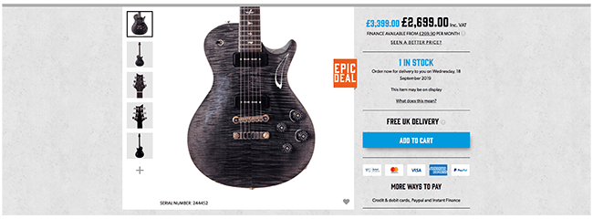
Andertons Music Co lets customers know how many they have in stock of particular items.
This is quantity-based scarcity.
Another tactic is to use time-based scarcity. This is where you make a product or a deal available only for a short period. People are driven to action lest they miss out on the deal.
Countdown timers are a popular tactic to show this type of scarcity, used extensively in Amazon’s Daily Deals section:

Amazon has a running countdown timer for its daily deals (Image credit: Amazon.com)
Remember: scarcity can be real or artificial. If you want to motivate people to act on an offer that can practically have an infinite supply (such as an online course), don’t use scarcity for the sake of it. Short-term, you’ll get more conversions but it can negatively impact your brand over the long-term.
For some offers it may make sense to limit availability so you can provide enough support to each student. Or to offer a time-based promotion in advance of course updates.
2. Substantiate value with social proof
The first question anyone who visits your landing page asks is: “What are you pitching me?”
The second question they ask is: “Why should I trust you?”
You can use all the landing page best practices around, but if you can’t create this sense of trust, your customers won’t buy from you.
One way to build this trust is through social proof.
This is a persuasion principle we’ve seen in all walks of life. Things that appear to be popular also tend to be more in demand. A restaurant with a long line outside it appears to be better than one that’s empty – even if the truth might be the opposite.
Essentially, we rely on the judgment of others when making decisions. Popular things must be good because why else would they be popular?
When thinking about social proof, consider two things:
- Strength in numbers: If a lot of people like you (or your product), your product is perceived to be better. A product with just two 5-star reviews might not be good. But one with 1,000 5-star reviews can’t be all that bad, right?
- Transferred popularity: Social proof, like authority (which we’ll cover below) can be transferred. A popular celebrity endorsing a brand makes the brand appear more popular. This is the reason why the influencer marketing industry exists in the first place.
The easiest way to add social proof is through reviews and testimonials. This also taps into the “people like me” gambit (more on this later).
For example, LifeLock adds customer reviews in a prominent location on its landing page. The positive rating and a large number of reviews (which it makes sure to highlight – “9,000+ reviews”) make the product a socially proven choice.
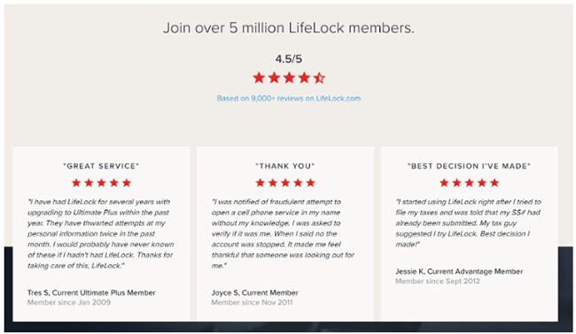
LifeLock crates social proof by sharing reviews for its product on its homepage (Image credit: LifeLock.com)
Another way to add this social proof is by showing a real-time counter of the people who are buying or using your products, such as this page on Fomo.com.
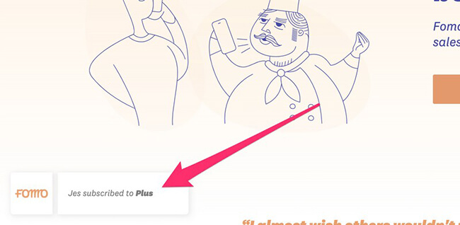
Fomo.com shows a running counter of people taking action – buying, subscribing, etc. – on the site
3. Make yourself appear more authoritative
Picture this:
You’re at the hospital for a regular checkup when two men politely ask you to take some pills.
The first man has a one-week stubble and is wearing shorts, an oversized t-shirt, and flip-flops.
The second man is wearing a doctor’s coat and has a stethoscope around his neck.
Who are you more likely to follow? The second man, of course – mostly because of the perceived authority of the doctor’s uniform.
This might be an overt example, but we look for subtle signs of authority when deciding who to trust – even on landing pages. A product that was recommended by NYTimes appears better because people trust the authority of NYTimes.
On landing pages, authority comes in two flavors:
- Implicit authority: This happens when a page adheres to the design and copy standards set by authoritative sites in the same field.
- Explicit authority: This is when you use a clear and explicit signal of authority – such as a recommendation from a trusted source.
At the very least, all your landing pages should have implicit authority. This is simply a matter of getting your design and copy right. A grammatical error in your headline can make you come across as amateurish and untrustworthy.
Explicit authority signals are hard to procure but can instantly make you appear more authoritative. These signals can come in various forms, such as:
Celebrity: Celebrities are seen as authoritative figures, even if they have nothing to do with the product. This is an example of authority through social proof.
For example, Masterclass.com uses landing pages that feature its celebrity teachers.
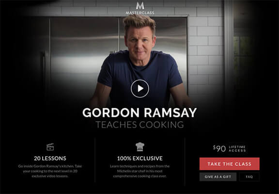
Masterclass built its entire business model on celebrity-based authority (Image credit: Masterclass.com)
Expertise: A recommendation by a recognized expert in a field – such as a doctor – tends to carry more weight than one by a nobody.
For example, this landing page from Einstein Medical uses a doctor’s testimonial to build authority through expertise.
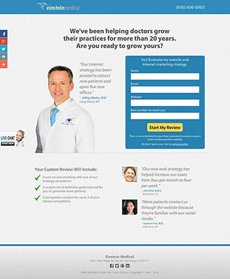
Using images of trusted experts – such as doctors – is a good way to create a sense of authority (Image credit: EinsteinMedical.com)
Institutions: Institutions and organizations that are widely respected tend to transfer some of their authority when they recommend you or your product.
Keep in mind that “institutions” don’t have to be universities or public organizations. Even respected businesses and publications are seen as institutions.
For example, this landing page uses rankings from a respected publication – PCMag – to create a sense of authority.
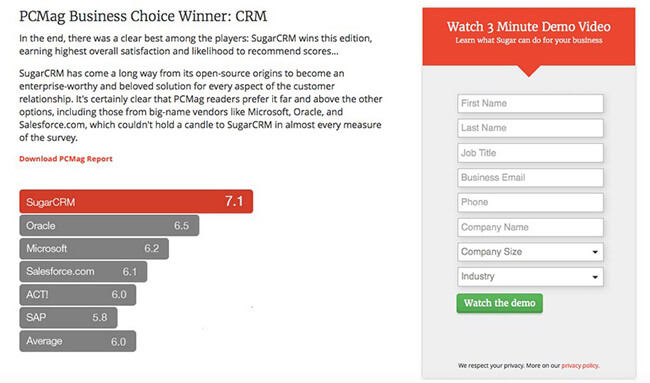
SugarCRM shares its ratings from a trusted institution – PCMag – to create a sense of authority (Image credit: Instapage)
4. Use the “just like us” gambit
There’s a common tactic in sales called “mirroring”. This is where you mirror the actions and behavior of your customers in the hope of making them like you more.
Research shows that this sales tactic is actually rooted in solid science. We prefer people who we think are similar to ourselves. In fact, this desire to gravitate towards “like-minded people” is hard-wired in us.
In other words, we like to buy from people and companies who are “just like us”.
This is a powerful and underutilized tactic in landing pages. By “mirroring” your target customers, you can make your landing page more appealing.
One way to do that is by mirroring your target audience in your landing page images. If you’re selling to single 18-30-year-olds, don’t use pictures of middle-aged couples in your landing pages.
Similarly, mirror your audience’s writing style. Don’t use slang and memes when selling to 50-year olds.
Another tactic is to include testimonials and reviews from everyday people. It makes your customers feel that your product is used and liked by people “just like them”, as in this example:
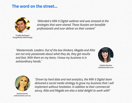
By sharing reviews and testimonials from fellow entrepreneurs, this page comes across as more authentic (Image source: Unbounce.com)
5. Label your audience
In a study, two groups of would-be voters were told that they were “politically active” and “politically inactive”. This was done randomly and had no basis in their actual political inclinations.
At election time, the group that was told they were “politically active” had a 15% higher turnout.
This study highlights a phenomenon large companies have known for years: if you explicitly label a group of consumers, you can affect their behavior.
This is why companies have rewards programs that clearly identify program members as “Platinum” or “Gold” members. The very act of identifying a customer as a superior customer can promote loyalty.
In a way, this is an extension of the “just like us” gambit, except it focuses on the customer’s idealized self-image, i.e. how the customer wants to see himself. By labeling the customer as per this idealized self-image, you appeal to his self-interest and thus, drive more action.
For example, this ConvertKit landing page clearly identifies that it’s for professional bloggers.
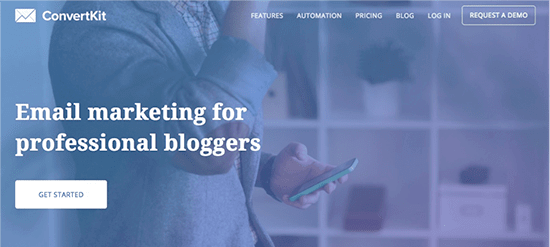
ConvertKit labels itself as a tool for “professional bloggers”
This serves two purposes:
- It appeals to bloggers who see themselves as “professional”. Even if they aren’t, bloggers who are serious about their craft would want to label themselves as such.
- It excludes bloggers who are not professional (or don’t see themselves that way). This means that anyone who does sign-up has much better product-market fit.
Note: ConvertKit no-longer use this landing page but it played a crucial role in it’s early growth stage.
Labels aren’t limited to professions; you can even label your customers based on their qualities (or rather, the qualities they believe they have).
Here’s a great example: this landing page says that the product is for hard-working people.
Image source: MarketingResults.com.au
What kind of customer doesn’t think they’re hard-working?
Be careful with this approach though. If you adopt too narrow a label, you risk alienating people who don’t identify themselves with it. This is why if you’re going to use this tactic, use it only for products that serve a narrow market.

Landing page design best practices
Design has a powerful impact on landing page conversions.
However, “good design” on a landing page looks very different than “good design” on a website homepage. While the latter might prioritize brand building, the former is laser-focused on conversion rates.
Since the emphasis on conversions means that some popular design practices have to be thrown out of the window. You might use a video background on your homepage, but if you add one to your mobile landing page, you’ll just annoy users.
With this in mind, let’s look at some of the top design best practices.
1. Appeal to convention, not innovation
An unexpected landing page best practice is to not follow certain best practices.
This sounds contradictory, but it is rooted in how people interact with web pages. By habit, certain conventions have become an expected part of these interactions.
Even if some of these conventions are technically wrong, not following them can confuse your audience.
Take the mobile hamburger menu as an example. When it was first adopted by mobile sites, UX experts wrote lengthy articles on why it’s bad for user experience.
Designers, of course, didn’t listen. And today, you’ll be hard-pressed to find a mobile website that doesn’t use a hamburger menu. Even TechCrunch, which featured its criticism, has one on its mobile website.
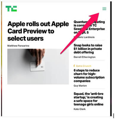
TechCrunch uses the familiar hamburger menu on its mobile site (Image credit: TechCrunch.com)
If you were to suddenly switch from hamburger menus to something that is technically more UX friendly, you might check a UX “best practice” box, but end up confusing users.
Keep this in mind when you’re making any design decisions. Something might be right from a usability or design best practice point of view, but it can hurt conversions if you go against convention, i.e. what users expect.
When it comes to landing pages, sometimes it’s better to not reinvent the wheel.
2. Limit yourself to one idea per page
Dozens of competing ideas, multiple visual styles, several competing CTAs…
You’ve probably landed on a page like that and dragged your mouse straight to the ‘back’ button. Here’s an example:
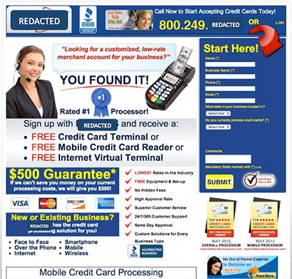
This landing page has several CTAs which confuses users (Image credit: SearchEngineLand.com)
A design that has more than one offer or idea goes directly against the very idea of a landing page. Landing pages are meant to be highly focused, laser-targeted conversion vehicles. Crowd them with too many choices and you’ll just confuse users.
This applies to every element of the landing page design:
- Your copy should have the same style throughout the page. Don’t switch from sincere and business-like to conversational and casual mid-page.
- Your design language should be the same for the entire page. If you’re changing colors, make sure they’re complementary, not clashing.
- Your font should remain the same. Also, make sure that your font sizes follow an expected scale (i.e. H1 is larger than H2, which is larger than H3, etc.).
Most importantly, keep just one idea on any landing page. If your company sells two types of products, create separate pages for Product A and Product B; don’t pitch them on the same page.
3. Design things to be what users expect them to look like
If I were to ask you to describe what a link looks like, what color would come to your mind?
A bright neon green shade or a solid blue color?
Blue text looks more like a link because it is the default link color on a lot of popular websites, including Google and Wikipedia.
While websites use links in a range of colors (this site uses light blue), we reflexively associate links with the dark blue I shared above.
That’s because over several years of Googling and Wikipediaing, we’ve come to expect links to be blue. So when we see any text that’s blue and underlined, we naturally assume it’s a link.
Use this fact to your advantage. Any element you use on a page – a button, a link, an alert box – should look like what users expect it to look like.
If you’re showing a countdown timer that’s about to run out, use the color red, not green. Your users shop on Amazon; they know what an ending timer on a deal looks like.
If you’re creating a button, make it appear clickable. Use subtle shadows and colors that make the button pop, inviting clicks.
See the ‘Buy’ button on Apple’s site as an example. A simple shadow effect makes it stand out against the surrounding text.
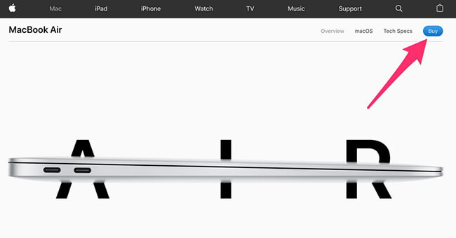
Apple’s ‘Buy’ button has a subtle shadow effect to make it stand out (Image credit: Apple.com)
One way to know what users expect an element to look like is to follow a popular design framework like Bootstrap. Since countless sites use the default design in the framework, it can quickly become “expected”.
For example, Bootstrap’s color scheme for different text boxes is now often considered the default for different alerts.
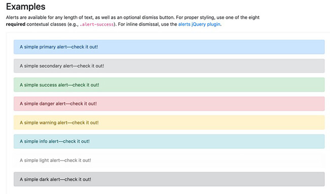
Bootstrap’s popularity as a design framework means that its default colors are instantly recognizable (Image credit: GetBootstrap.com)
4. Experiment with colors
What does this color remind you of?
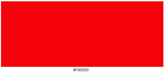
A bright red shade evokes emotions of power, hunger, and vitality, which is why it is popular among sports teams and food brands.
While individual memories will vary, I can say that this color won’t remind you of cold, foggy mornings and boring business meetings.
Color has a big impact on how users interpret your landing pages. This mostly stems from two things:
- User expectations based on real-world and digital experiences
- Our primal response to different colors, i.e. color psychology
The color “green”, for instance, is almost universally associated with “go” thanks to traffic lights. It is also associated with nature – for obvious reasons.
If you’re selling natural healthcare products or want users to “go” to a CTA, you would be wise to use the green color as the example below shows:
We associate the color ‘green’ with nature and health, which makes it a suitable option for natural brands.
Check out this page for a list of psychological effects associated with different colors.
A great example of the subtle differences in colors and how they impact brands and user behavior is Box.com vs DropBox.com.
Both these companies offer the same services – cloud data storage. But one is focused exclusively on enterprise sales (Box.com), while the other also sells to individuals and small businesses (DropBox.com).
So, while Box.com uses an enterprise-friendly blue shade, Dropbox.com plays around with variations of blue and other colors as well (maroon, light blue).
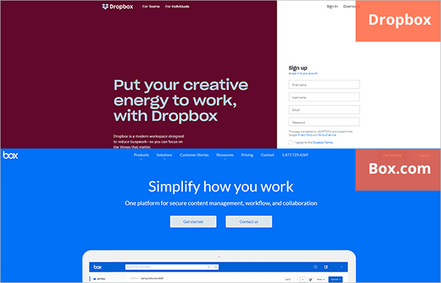
Box.com and DropBox use blue differently based on their target audience.
When you’re selecting colors for the landing page, ask yourself:
- What kind of products are you selling? Enterprise or small business? Individual or business-focused? What category does it belong to? Choose your colors accordingly.
- What emotion do you want your users to feel on the page? Energy, security, joy, vitality, or calmness?
- How old is your target audience? The colors you choose for seniors will be very different from those you choose for 18-year-olds.
5. Avoid visually distracting effects
You might have seen a recent trend of businesses using videos in their header backgrounds. Airbnb is a famous culprit.
This practice might be great for telling a story and building a brand, but it is a practice to avoid if you want to increase conversions.
Remember what we talked about earlier: good landing pages have a single-minded focus on the CTA. Everything else is supporting evidence to get people to click on it.
When you add distracting visual effects to a page – a background video, a complex animation, etc. – you force users to look away from the CTA.
This is bad for your conversions. If your users are too busy admiring your snazzy video (especially when it’s in the background), they might miss the CTA entirely.
If you absolutely must use fancy effects, use them in the service of your CTA. You might use an animated button or add a video (not background video) that tells a story and drives people to the CTA.
For example, the Dollar Shave Club landing page features video to educate customers about the offer.
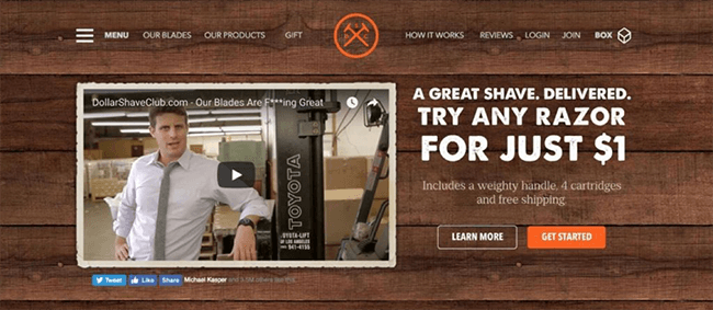
A non-distracting, clickable video conveys your message without confusing visitors (Image credit: DollarShaveClub.com)
6. Remove navigation and social buttons
In the spirit of the above landing page best practice, go ahead and remove your navigation menu and social sharing buttons as well.
In fact, remove anything that’s not directly tied to the CTA.
The reason is the same: you don’t want to give people multiple choices. When they land on your page, they should have just two options: click your CTA or hit the back button.
By removing superfluous elements – navigation, social sharing, etc. – you reduce the number of attention points on the page.
A HubSpot case study found that removing the navigation led to a statistically significant increase in conversions:
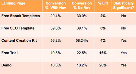
Removing the navigation leads to a marked improvement in conversion rates for these test pages (Image credit: HubSpot.com)
You’ll notice this practice on pages where conversion focus is absolutely necessary, such as checkout pages.
Head over to Amazon right now and try to buy an item. As soon as you get to the payment page, you’ll find that Amazon’s normally ubiquitous navigation menu disappears.
7. Select your pictures carefully
But not all high-quality imagery works well. You’ve probably cringed at seeing a brightly lit corporate scene lifted straight out of a stock photo library.
You already know that good quality images are crucial for a quality user experience. In fact, 67% of users even say that high-quality images are “very important” for making a purchase decision.
You feel that way because:
- There is nothing authentic about the image (it is literally stock imagery), and..
- There is a disconnect between the image and the experience it describes. Happy offices don’t look like stock images.

Stock images like these feel unnatural and staged (Image credit: StockUnlimited.com)
The latter is particularly important since it springs from dual-coding theory. This theory states that ideas appear stronger when they are described through both text and supporting images.
Conversely, if there is a mismatch between the text and the image supporting it, the idea becomes less persuasive.
Think of a page from a Stephen King horror novel with a Spongebob Squarepants illustration next to it. The horror prose would feel almost comical thanks to the illustration (or you might develop an existential fear of the sponge that lives in a pineapple under the sea).
Some of this is obvious enough – if you’re selling athletic wear, you’d use an image of an athlete mid-workout, not of someone relaxing in beach shorts.
But what happens when you’re selling, say, meeting software? Do you simply show an image of a meeting or something else?
In these scenarios, try to choose images that represent an idealized state of your users. That is, the state they want to achieve (by using your products).
A company selling meeting software isn’t just selling meeting software; it’s selling the time savings and happiness employees will derive from not attending meetings.
So when you’re selling this software, you don’t want to use images of people stuck doing exactly what they want to avoid: being in meetings. Instead, you want to focus on images that talk about what they hope to get: more time, fewer meetings.
Take a look at this landing page from ToDoist, a task management tool. It doesn’t show people locked away in their offices. Instead, it shows them out and about doing things they love – spending time with friends.
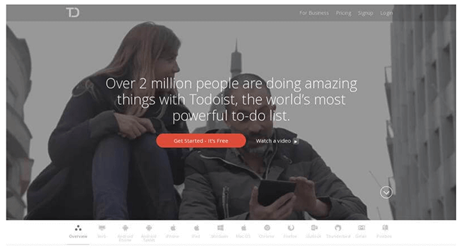
Focus on the result you want customers to achieve in your landing page images (Image source: BitCatcha.com)
8. Use directional cues
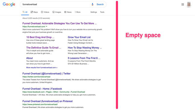
Most users online read web pages in an F-shaped pattern as represented in this frequently quoted study:
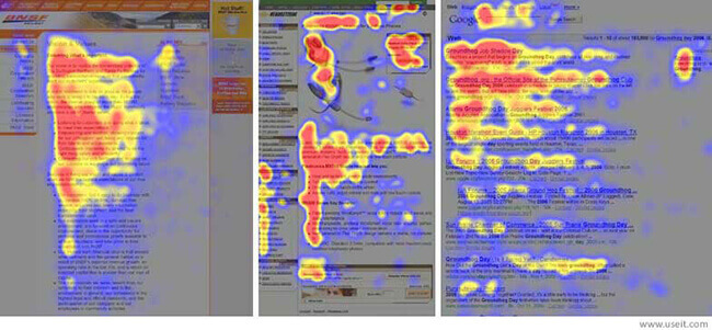
People usually scan pages in an F-shaped, left-to-right pattern (Image credit: NNGroup.com)
Again, this stems from convention. On most web pages, the important information is at the top and to the left. Think of Google’s search results. The right side of the page is mostly empty.
But what if you wanted to “hack” how the user’s gaze moves down a page? Or more importantly, what if you wanted them to focus on a particular element on the page – like a CTA?
That’s where directional cues come into the picture.
Take a look at this eye-tracking study:
People reflexively look where models are looking at in images (Image credit: LinkedIn)
Our gaze is instantly drawn to the direction the baby is looking at. This is a hard-wired human phenomenon present across cultures. We are genetically programmed to follow others’ gaze. Call it a holdover from our hunter-gatherer past.
You can use this gaze locking on your landing page to draw attention to CTAs and other key page elements – like in the above example.
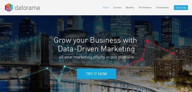
That’s not the only way to use directional cues. You can use overt cues, such as arrows.
Using arrows is an easy way to draw attention to a page element
If arrows are too overt for you, you can use design elements such as lines and object positioning to draw attention to CTAs and other key elements as the example below shows:
A horizontal line running across the page draws attention to the CTA
Whatever option you choose, your goal should be to use your design in subtle ways to get people to look at important elements on the page.

Landing page copywriting best practices
There’s a strong argument to be made that good copywriting alone is enough to make a killer landing page.
In fact, before the current crop of visually rich landing pages, most sales pages focused entirely on copy. Remember those stark white pages with the often outrageous headlines in bright, striking red?
While such landing pages might have passed into the realm of parody today, long-form copy is still one of the best ways to sell something online.
Even if your goal isn’t to directly sell something but to simply collect emails or share an eBook, focusing on copy should be your top priority. In the section below, I’ll share some landing page best practices for copywriting that will help you convert more visitors into leads.
1. Make your value proposition explicitly clear in the headline
Have you ever landed on a page and struggled to figure out what exactly was on offer?
This is one of the most common copywriting mistakes people make on landing pages. They use too much jargon and cryptic, brand-focused copy instead of making their value proposition explicitly clear.
This problem has two underlying causes:
- There’s a gap between the business’ and the audience’s understanding of the product. The business focuses on the technical features but fails to translate it into terms the users can understand (a common problem with tech landing pages).
- The business treats the landing page as a branding vehicle and not a conversion vehicle. And so, it ends up using brand-focused copy – the kind found on billboards for large brands – instead of conversion-focused copy (the kind found in direct sales).
The antidote to both of these problems is the same: focus on the value proposition, not the brand or the technical features.
Consider good landing pages like this:
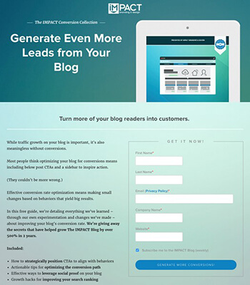
Image credit: ThemeIsle.com
Part of what makes them good is their clarity. You don’t have to wonder what’s on offer and what you’re supposed to do next. The headline spells out the benefits clearly to all visitors – ‘generate more leads’.
Try doing this in your landing page headlines:
- Remove jargon and translate it into layman-friendly terms. The only exception is if you’re selling something to a hardcore technical audience.
- Be clear about the subject of the landing page and what readers can get out of it. Leave brand-focused copy to big brands; your goal should be conversions.
- Focus on the audience and the benefits/results they seek. If you’re selling exercise equipment, one headline targeting busy professionals might focus on the time savings. Another targeting fitness enthusiasts might focus on its fitness benefits.
2. Align features and benefits with audience expectations
A common landing page best practice is to focus on benefits, not features.
While this is a good rule to follow, it isn’t universally applicable. Focus too much on the benefits with a knowledgeable audience and you’ll come across as pandering. Focus too much on features and you risk alienating low-knowledge users.
A much better best practice is to align features and benefits with the audience’s expectations and knowledge-level.
But let’s back up a second: what exactly are features and how do they differ from benefits?
Features are the what of your product. They convey information, telling users what your product contains.
Benefits are the why of your product. They persuade users, painting a picture of the better life (or solved problem) they will have if they buy from you.
A good landing page has a healthy mix of features and benefits. You pitch the benefits first, then list the features that will help users realize the benefits.
For instance, if you’re selling a laptop, you might tell users how your laptop will help them work faster (i.e. the benefit). To back up this benefit, you can list its faster processor, more RAM, and better storage (i.e. the features).
Apple does this wonderfully well. On the MacBook Air’s landing page, for instance, the headline mentions the benefit (“performance”), but the copy talks about the technical features that make this benefit possible.
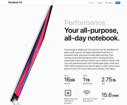
Apple’s MacBook landing page mentions the benefits first, the features second (Image credit: Apple.com)
This Benefit-Feature pattern is good enough to follow on most landing pages. There are, however, two situations where you might want to change it:
- Low-knowledge users: If you’re selling to an audience that has little understanding of the technical specs of a product (such as beginners) or the product features are indistinguishable (such as furniture) it is better to emphasize benefits.
- High-knowledge users: When selling to experienced users (such as geeks or hobbyists), focus more on the features than the benefits. Experienced users already understand the benefits; they just want better, faster versions of their existing products.
Consider this landing page for an advanced MIDI controller from Nektar.
Since it is aimed at professionals, the landing page copy uses tons of jargon – VST/AU compatibility, MPC, DAW – that would be pure gibberish to beginners. But for pros, these features are a vital selling point.
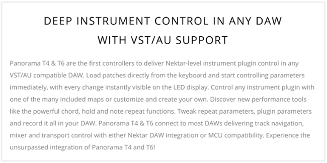
When selling to experts who understand the jargon, focus on features (Image credit: NektarTech.com)
3. Use “power” words
Here’s the opening paragraph on Apple’s Mac Pro landing page. I’ve highlighted a few words for reference:
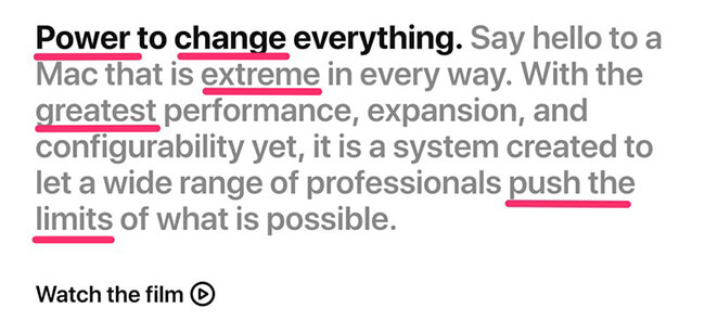
Using powerful, visually rich language is a time-tested copywriting tactic (Image credit: Apple.com)
Notice how many adjectives Apple uses in this one paragraph of copy. In fact, if you go through the page, you’ll find dozens of instances of words like “greatest”, “extreme”, “brilliant”, etc.
In copywriting, these are “power” words. Words that grab your attention and make you feel certain emotions (usually awe and joy). They elevate plain copy into something that strikes you at an emotional level.
Old school copywriters were masters of using these power words. Look through copy written by David Ogilvy or Leo Burnett and you’ll catch tons of these words as in the example below:
This ad, written by David Ogilvy, has a surfeit of visually rich power words (Image source: RandallReilly.com)
SmartBlogger.com has a list of over 600+ power words. Try using them in your copy. Just be careful to not overuse them; your copy shouldn’t sound like it was wrung through a thesaurus.
4. Address fears, uncertainties, and doubts (FUDs)
You’ve designed a beautiful page, tested dozens of high-converting headlines, and written pitch-perfect copy. Your customers are just about to buy but they hesitate. What if they don’t like the product? Will you take it back? How long do you guarantee the product for?
Questions like these represent your customers’ fears, uncertainties, and doubts (FUDs). This is the kind of stuff that keeps your customers from buying your products (or worse, going to a competitor).
Some common FUDs when buying online are:
- Product quality
- Company trustworthiness and legitimacy
- Returns and exchanges
- Payment information safety
- Personal data safety
Directly addressing these FUDs is a great way to move the conversion needle.
For instance, to address customer concerns about returns, you can offer a 60-day, no questions asked money-back guarantee. To show customers that you’re legitimate, you can share testimonials and reviews from other customers.
Try including a FAQ section that directly answers all the questions a customer might have about your product or company. You can even be tongue in cheek about it, as in this example:
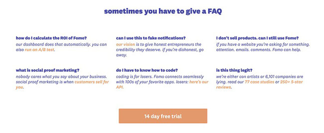
Directly address your customers fears and doubts with a FAQ (Image credit: Fomo.com)
5. Don’t hide crucial information (such as prices)
Have you ever visited an online store, added a product to your cart, and abandoned the site midway because the store added a shipping charge right before checkout?
You’re not the only one. Not being able to see the exact final cost upfront remains one of the leading causes of shopping cart abandonment.
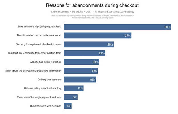
Customers often abandon shopping carts when they can’t see the final cost upfront (Image credit: Barilliance.com)
While it might be limited to shopping pages, this phenomenon highlights an important aspect of user behavior: people don’t like to be surprised. Especially when the surprise is something as unpleasant as extra costs and shipping fees.
In your landing pages, make sure that all mission-critical information is visible upfront. Don’t tuck away unpleasant terms and add-on prices at the bottom of the page. Such UX dark patterns are not only unethical but might also be illegal.
Some critical information that should be clear to users includes:
- Prices, including add-ons, fees, and other extra charges
- Shipping charges and restrictions
- Personal data storage and use (if you’re going to send users newsletters, tell them upfront)
- Product usage terms and conditions
- Affiliated products, companies, and links
6. Use information hierarchy in your copy
We’ve talked about headlines and benefits and mission-critical information.
But how exactly do you organize all this copy on your page?
Some bits are obvious of course – headlines go at the top of the page. With others, however, it’s not always clear. Should you talk about your product’s speed first, or its super cheap pricing? When should you mention your company’s history and product reviews?
One way to bring structure to this mess is to follow an information hierarchy.
Roughly, this hierarchy is as follows: What > How > Why > Who > What next?.
- Headline: Start the page with a headline that matches the traffic source and its expectations (see landing page best practice #2 above).
- What is it? Tell readers what you’re selling them. For a novel product, you’ll have to invest substantially in explaining the product’s functioning and purpose.
- How does it work? Show readers how the product works or how it yields your claimed results.
- Why buy it? This is where you go in-depth into the product’s claimed benefits.
- Why believe us? Reinforce the benefits further by offering social proof, testimonials, etc.
- Who we are: Include a brief note on who you are, your history, and what makes you qualified to deliver the benefits/results you promised earlier.
- What next? Tell readers what they should do next (usually includes a CTA)
You don’t have to follow this hierarchy every time, of course, but it’s a good blueprint to follow. You can add/remove sections when necessary, but make sure to include a headline, and the what/why sections.
7. Improve the legibility of your copy
Legibility – how easy it is to browse your landing page – is a function of page design. But good copy formatting can also help. Simple landing page best practices such as using bullet points and generous line breaks can make your page much easier to read.
Some tactics you can use to improve the legibility of your copy are:
- Use short sentences
- Limit each paragraph to 2-3 sentences at most
- Use bullet points
- Use subheaders
- Bold/italicize keywords, subheaders, and important phrases
That’s about formatting. But you can also make your copy more legible by changing your writing style. Generally speaking, copy that’s more conversational is easier to understand and follow.
Adopt tactics such as:
- Address the reader directly, i.e. write in the second person (“you”)
- Use fewer and simpler words. A landing page isn’t the place to showcase your vocabulary.
- Aim for a 5-7 grade writing style (check your writing grade here).
- Use “visual” language, i.e. words that make readers associate a certain visual with your copy. “Fast” is nice, but “Fast like Usain Bolt” helps readers visualize the speed.
- Frame time and money into easy to understand terms. For instance, if something costs $2, you can say that it costs “less than your morning coffee”.
For example, this page translates the cost of the service in easy-to-understand terms:
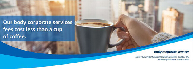
Convert complex ideas into easy-to-understand metaphors to improve the legibility of your copy (Image credit: Picagroup.com.au)
8. Match headline with traffic source
What users want to see on any landing page depends on what they were doing before they landed on the page.
Which is to say that all users arrive at your page with some pre-embedded information, and this information depends entirely on their prior behavior.
A user who found your landing page while scrolling through Instagram feeds of NYC-based creative agencies has different expectations than one searching for “NYC creative agencies” on Google.
Within this framework, think of the headline one half of a two-piece puzzle. The other half is made up of the expectations and behaviors the user carries over from what she was doing before landing on your page.
When these two halves match, the transition feels seamless to the user and gets you better conversions.
For example, a user searches for “productivity software for content marketers” on Google. He finds your landing page filled with information relevant to content marketers.
But if you show the exact same page to users searching “productivity software for students“, you’ll just end up disorienting them. There is no connection between their pre-click behavior and the landing page itself.
When you’re crafting your landing page copy and design, always take one step back. Ask yourself:
- What is the source of this traffic? How does this affect their expectations from the landing page?
- What was the user trying to accomplish before she landed on your page?
- Does the user fall into a specific demographic or psychographic category? What copy or design elements can you use to emphasize this category?
The above can be achieved using something called “dynamic text” replacement. Not all landing page builders offer this feature, but Unbounce and Instapage do.

Mobile landing page best practices
I don’t have to parade a bunch of statistics to prove the importance of mobile design for landing pages.
You can see it yourself – people glued to their screens wherever you go, more and more businesses becoming ‘mobile-first’, and even Google adopting ‘mobile-first’ indexing.
It’s clear that the future of computer interactions is mobile-first. So it stands to reason that good mobile design needs to be one of your top priorities.
Fortunately, good mobile landing page design isn’t that different from desktop pages. As we’ll see below, follow a few basic design principles can easily make your landing pages mobile-friendly.
1. Reduce page size
Keeping your landing pages as small as possible (in file size, not length) should be a priority, regardless of who you’re targeting.
But page size becomes far more important for mobile users. For starters, even with the advent of 4G (and now, 5G) a large number of users – especially in developing countries – are on 3G.
And even when 4G is available, it is substantially slower than broadband. The top-rated Verizon 4G network in the US, for example, has a speed of 20.9 Mbps. The same for the top-rated broadband network in the US is nearly 70 Mbps – more than 3x faster.
In fact, as Google’s data points out, as a mobile landing page load time goes from 1s to 6s, the chance of a bounce increases by 106%.
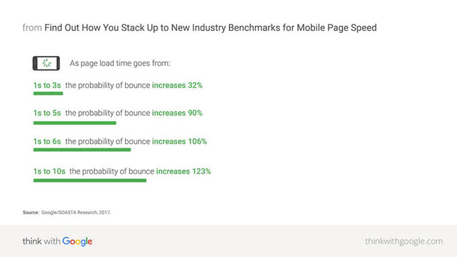
Smaller pages load faster and reduce bounce rates (Image credit: ThinkWithGoogle.com)
Given that you’re almost always dealing with less-than-broadband speeds, you have to do your best to keep the page file size as small as possible.
Here are some ways to achieve that:
- Start by benchmarking your current speed by using Google’s page speed tool.
- Compress all images. Where possible, remove images or use simpler graphics (such as an SVG line illustration instead of a photograph).
- Reduce the number of requests by removing custom fonts and combining JavaScript and CSS files.
- Shift unnecessary CSS and JavaScript files to the bottom of the page so that they don’t slow down the page from loading.
- Use faster-loading elements and images in your above the fold area.
2. Simplify the mobile visual experience
The mobile user experience is marked by limitations, especially on speed, screen size, and user interactions (you can’t type as easily on mobile as on desktops).
Of these, working within the limits imposed by tiny mobile screens is crucial for lifting conversions. If you simply transcribe your desktop pages to mobile, you might find that 30-40% of your screen real estate is used up by useless elements (like navigation).
The solution is to simplify the mobile visual experience as much as possible.
Some tactics you can adopt include:
- Remove or simplify navigation. Instead of a dropdown menu, try using a hamburger menu
- Reduce “visual bloat”, especially in critical areas (such as above the fold and CTAs). Users shouldn’t have to struggle to figure out your headlines from the background images, or the CTA from sales copy.
- Design elements to be tapped, not clicked. Use larger buttons and change selection elements in forms to be used on mobile (like a scrolling date selection option instead of a calendar – more on this later).
- Remove or simplify elements that are difficult to use on mobile. For instance, tables and tab/accordion displays are difficult to display on mobiles. Replace them with plain text instead.
For instance, Country Chic paints uses large headlines, clear copy, and a stick CTA in the top bar to convert users.
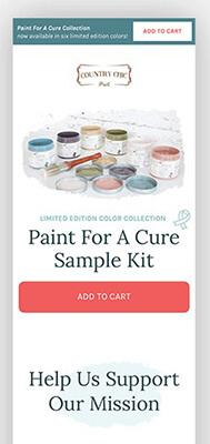
Large buttons and headlines make this landing page easy to read (Image credit: Unbounce.com)
3. Optimize conversion elements for mobile users
The “conversion elements” on any page are the elements you want people to interact with – forms, opt-ins, and CTAs.
Optimizing these for mobile screens is a key landing page best practice.
There are two things to consider when you’re optimizing these conversion elements:
- Design: Change the design to fit the limitations and expectations of mobile users. Sometimes, this means removing elements (such as fields in a form), and sometimes, changing how an element looks (such as the size of a CTA).
- Relevance: Change CTAs and forms to ask for information that’s relevant to mobile users. For instance, instead of sending you an email, you might ask users to give you a call in a CTA.
A great example of mobile-centric conversion design can be seen in mobile forms, specifically, with date selection.
On desktops, the familiar calendar design works well, but on mobiles, the small size is too unwieldy. Which is why many of the best converting forms use scrolling wheel selectors (more on this below).
Here’s another example of a mobile-friendly CTA design from Paypal. Notice how large, tappable ‘+’ buttons replace smaller, clickable elements.
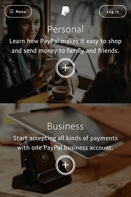
Paypal replaces text buttons with large, tappable icons on its mobile landing pages (Image credit: Paypal.com)
Similarly, this landing page uses a click to call button for mobile users. Calling is far more relevant (and easier) on mobiles than it is on desktops.
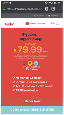
Replacing ‘Click to email’ with ‘Click to call’ on mobile pages takes advantage of the unique capabilities of the smartphone platform (Image credit: Pinterest.com)

CTA design
The CTA is arguably the entire purpose of any landing page. This is what you want people to click on. Everything else is noise.
Perfecting the CTA has obvious benefits in any landing page. Increasing CTR from 1% to 2% can have a compounding effect on your sales further down the line.
Let’s look at some landing page best practices for CTA design below.
1. Use contrasting colors
One of the worst landing page mistakes you can make is to blend the CTA into the rest of the design. If people can’t even see the CTA, how are they supposed to click it?
The easiest way to draw attention to the CTA is by using contrasting colors. If your entire landing page is blue, a bright orange CTA is surely going to stand out.
Like this form from WishPond:
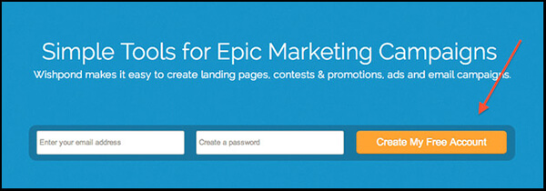
The orange button stands out against the blue background (Image credit: WishPond.com)
A good way to find contrasting colors is to use the color wheel. Colors on the opposite end of this wheel (such as blue-orange) tend to contrast each other quite well.
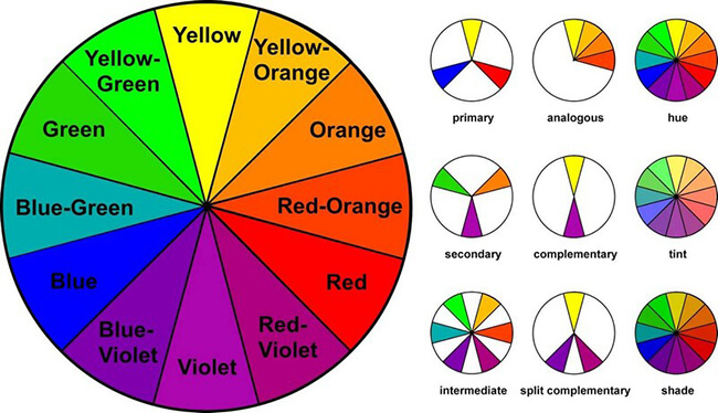
Use the color wheel to find complementary colors that stand out on the page (Image credit: Lifehacker.com)
Be aware that there is no “best converting” color for CTAs. Rather, everything depends on the contents of the page itself. A red CTA can perform better than a green one (and vice-versa) based on the page colors and design.
2. Focus on value, not action in CTA copy
It makes sense to use action-focused copy in your CTA. After all, a CTA is a call to action.
But that’s not always true. Using action words such as “Click”, “Go”, “Start”, etc. might be better than using ambiguous labels (such as “Next” or “Continue”). However, they undersell the promise of the landing page itself.
The solution? Use value-focused copy.
With this approach, your copy would use words that emphasize the value users will get from your product or offer. Instead of using “Learn More“, you might use “Grow Your Business“. Or instead of “Click Here“, you might use “Yes, Increase My Traffic!“.
The idea is to reinforce your key benefit or value in the CTA. Action-focused copy tells you what to do, but value-focused copy tells you why it matters.
For example, this CTA focuses on helping users become “conversion masters”:
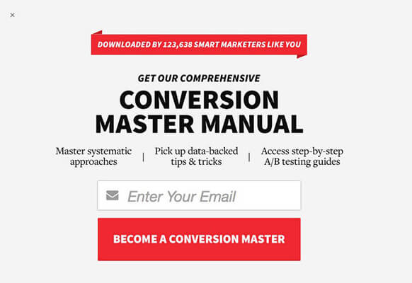
This CTA uses value-focused copy to emphasize the benefits of the offer (Image credit: WishPond.com)
3. Make the CTA stand out
As I mentioned earlier, your goal should be to make the CTA stand out on the page.
Using contrasting colors is one way, but there are other methods as well.
One common tactic is to add a border around the CTA button. This accentuates the contrasting color and draws the reader’s eye. It’s also a great way to highlight a CTA from other buttons on the page.
Another tactic is to add elements such as icons or labels to the CTA button. On this page, for instance, a little plane icon not only underscores the travel aspect of the CTA, but also draws attention to the copy.
A subtle icon can help your CTA stand out on the page (Image credit: HipMunk.com)
If that’s not enough, you can use design elements such as arrows to directly point to the CTA. Here’s one example:
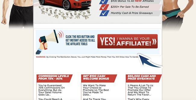
Use an arrow to draw attention directly to the CTA (Image credit: ConversionXL.com)
4. Experiment with CTA size and position
The Fitt’s law in interaction design states that the time required to move to a target (such as a CTA) is a ratio of the distance (from the cursor) to the target and the width of the target.
In other words, how “clickable” a CTA is depends on a) its size, and b) how far it is from the cursor.
A larger CTA, thus, becomes more “clickable” because it occupies more screen real estate. It is easier to move your cursor to a CTA that 500px wide than one that is just 50px wide.
This doesn’t mean that you should make gigantic CTAs – that’s just too obvious (and not to mention, ugly). Rather, you should make CTAs larger than surrounding elements.
As for position, your goal should be to keep the CTA close to the default resting place of the cursor.
For most people this is near the center of the page. Which is why you’ll find that CTAs are often placed near the center (especially on mobile) and above the fold.
The best example is from Google itself. The cursor location (i.e. the text box) is right above the CTA, making it easier to click.
Google’s buttons are located right near the center of the page, making them easier to reach (Image credit: Google.com)
5. Support the CTA with additional copy
CTA copy is an exercise in brevity. Unless you have a screen-wide button (an awful idea), you’ll have to keep your copy limited to 5-6 words at most.
But what if you want to substantiate the value offered in the CTA?
Easy: add some supporting copy to it, either as a part of the CTA, or in addition to the CTA.
Here’s an example from Sumo. The CTA is immediately followed by social proof validating the popularity of the tool. This is a clever way to add further value to your CTA without bloating it up.
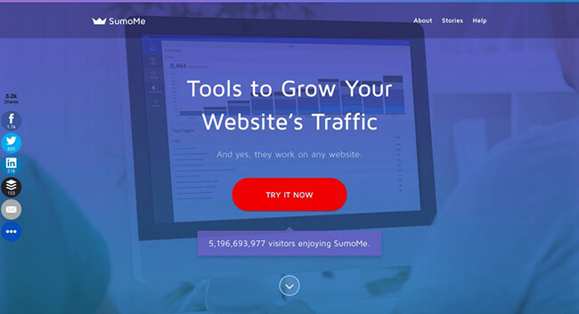
Extra copy after the CTA underscores the value of the CTA (Image credit: Sumo.com)
6. Use a scrolling CTA on mobile screens
For a CTA to attract clicks, it has to be visible in the user’s screen area. This is why it’s a common practice to add a CTA above the fold.
On mobile screens, however, you’re working with limited screen real estate. Once users scroll past the initial view area, they have to scroll significantly to click the CTA. Worse, since they can’t readily see the CTA, they are likely to forget about it altogether.
Solve this problem by adding a sticky scrolling CTA. This button moves along with the screen, being permanently visible.
For example, the CTAs on Trello’s homepage remain ‘sticky’ even as you scroll down the page.
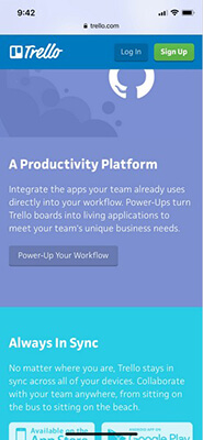
Trello uses “sticky” CTAs to make them easier to click (Image credit: Trello.com)
Try to keep this scrolling CTA small in size, especially if you have another sticky element (such as a menu or more frequently, a cookie consent button). Otherwise you risk crowding the screen too much and annoying users.
Also consider removing this scrolling CTA on older mobiles with smaller screens.

Form design best practices
If the CTA is the most important element on a page, the form isn’t far behind. After all, this is where you collect your data – the reason for your landing page.
How much effort you put into your forms will depend on what kind of data you’re asking users.
If you want just their email, you can ignore this section altogether. But if you want to squeeze out more important data – phone numbers, company emails, budgets, etc. – you will have to invest in design for your landing page form.
Let’s look at some landing page best practices for forms below.
1. Soften the pain
Imagine if you landed on a page for an eBook and were asked for your credit card number to read it (even if the eBook itself was free).
You’d press the back button, of course.
People don’t see all their personal information equally. Sharing a first name has less “pain” associated with it than sharing credit card information or home address.
Asking for less painful data first can encourage people to fill out more forms. If they’ve already shared two easy data points (say, first and last names), they might as well share a harder one (such as email) as well.
(In fact, this is called the Principle of Consistency in UX design.)
You can even illustrate their form-filling progress visually, such as this example from VentureHarbour:
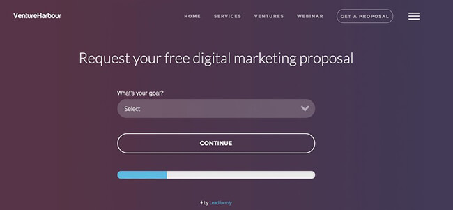
A multi-step form can feel easier to use (Image credit: VentureHarbour.com)
2. Simplify your landing page form
Do you really need to ask users their home address, zip code, business email, and company position?
In most cases, the answer will be ‘no’. Once you collect an email address or phone number, you can find other ways to collect this additional information (through email nurturing campaigns, for instance).
Strip down your forms to the bare essentials. Remove any fields that aren’t essential. Only ask for information that lets you get in touch with leads again (such as email or phone numbers).
3. Use mobile-friendly form UI elements
More and more of your users are accessing your landing pages on their mobiles. One study estimates that 58% of all traffic in 2018 was from mobiles.
Your mobile users limited by the size of their screens and the quality of their keyboards. Asking them to use the same form elements as your desktop users is a recipe for poor conversions.
Take the date selector as an example. On a desktop form, you’ll most likely use a calendar. This is a format most of us are intuitively familiar with.
But on mobiles, the same calendar becomes difficult to use. The small size of individual dates makes them difficult to tap.
Which is why the best performing mobile forms use the more mobile-friendly scrolling date selector, most commonly seen in iOS.
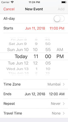
Scrolling date selectors are easier to use than calendars on mobile screens (Image credit: Apple)
This principle extends to all UI elements you use in mobile forms. From buttons to dropdown menus, everything should be designed for tapping, not clicking behavior.
For instance, dropdown menus are difficult to use on mobile screens. A better alternative is to condense them into small but tappable buttons.
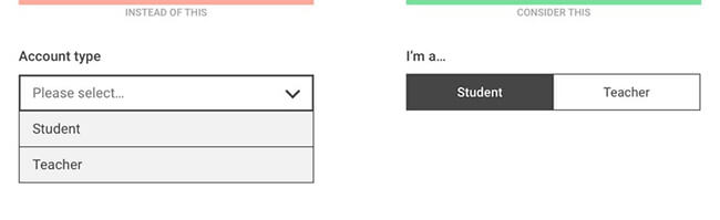
Replace hard-to-use dropdown menus with tappable buttons on mobile pages (Image credit: Medium.com)
Glossary of terms
This article used a lot of jargon. Here’s a short glossary of key landing page optimization terms you should know:
- CTR (Click Through Rate): The ratio of clicks to visitors to a landing page, expressed as a percentage. A 1% CTR means that out of every 100 visitors, one person clicks on a target element (such as a CTA).
- CTA (Call to Action): The primary point of action on a landing page – what you want users to click on. CTAs are usually buttons, but can also be text links and even phone numbers.
- CRO (Conversion Rate Optimization): The field of marketing that focuses on improving conversion rates of any marketing collateral, such as a landing page.
- Landing page: The page a visitor lands on from an external traffic source. While technically any page can be a landing page, the term is usually used for a dedicated page used to achieve a specific goal as part of a marketing campaign.
- Split testing: Also called A/B testing, this is the practice of funneling traffic to two different pages (Page A and Page B) in order to evaluate their effectiveness in converting users. The page that converts better can then be used in the actual marketing campaign.
- Bounce rate: The rate at which a visitor “bounces” or moves away from your page without clicking on any element.
- Conversion rate: The number of people who take a desired action on a landing page, usually expressed as a percentage. A conversion rate of 1% means that out of 100 people, 1 person takes your desired action. Conversion rates depend on your conversion goals.
- Conversion goal: What you want users to do on any landing page. This goal can be click a buy button, send an email, call a helpline number, etc.
- KPI (Key Performance Indicator): The metric(s) you use to evaluate whether a marketing campaign is meeting its intended goals or not.
- Value proposition: The key value that you offer to users to get them to convert. Your value proposition answers the question: What’s in it for me?
- Scarcity elements: Page elements – such as copy, UI or design – that create a sense of scarcity about your offer. This can compel people to take action if they think that your offer won’t be available for long.
- FUDs (Fears, Uncertainties, and Doubts): The key doubts a user might have about your offer, landing page, or business that can stop them from converting. These are sometimes also called “anxiety elements”
Over to you
Which landing page optimization techniques will you implement on your own website?
This list of landing page best practices is by no means exhaustive and there are additional factors to consider such as buyer personas (and how to integrate them into your landing page design).
But for most businesses and marketers, following these landing page tips will be more than enough to boost conversion rates.
As always, when it comes to building a landing page, your goal should be to keep testing variations.
Try out different headlines, images, and CTAs. Use these landing page best practices as a map, but let the actual testing results guide your path.