7 Strategies To Optimize Your Store’s Homepage For More Conversions
Your homepage is your virtual storefront.
It’s the place through which most visitors land on your store.
That’s where they make conclusions about your store and its products in a flash.
Mess it up and you will have people coming straight in and out of your store without buying a single item. Design it well and your visitors will stick around, browse, and buy your products.
But how do you do that?
In a word: make it rich.
The richer it is, the more conversion paths you create for visitors. It will lead them to different product categories.
Here are 7 proven strategies you can use to optimize your store’s homepage for more conversions, sales, and profits.
#1. Showcase your signature product on the main banner
Your store’s main banner is unmistakable. It’s the first thing shoppers’ eyes pick when they visit your store. So, make it count.
Use it to display your signature product.
Your banner must be:
- Dazzling – Include an exquisite high-quality custom product image to attract visitors’ attention. Stay away from stock images. People can smell them from a mile away and have become blind to them because they are common.
- Descriptive – State what you sell in your headline. Don’t complicate things, get straight to the point using simple language. More about how to do this on the next point.
- Directive – Urge visitors to take the next step with a clear call to action. You don’t want your visitors to stay on your homepage for too long. Lead them to your product pages with a direct convincing CTA. Tell them exactly what you want them to do next.
You can also use the prime banner spot to display your latest sale as Claire’s does:
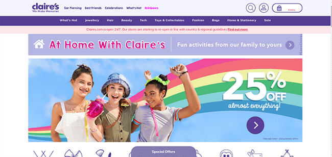
They put the sale front and center. Shoppers won’t miss it. Notice the arrow CTA on the right that encourages shoppers to shop on.
#2. Let your unique selling proposition (USP) shine in your headline
When people arrive at your store, several questions are running through their minds.
Questions like:
- Who are you?
- What do you sell?
- Why must I buy it from you?
- Are you trustworthy?
Your headline should answer most of these questions. In particular, reveal your philosophy and unique selling proposition (USP) to set your brand apart. Show what makes your products special so they choose you over the store next door.
A well-crafted headline the makes you stand out is:
- Clear – State what you offer, don’t be too clever otherwise you will confuse shoppers.
- Bold – Make a bold promise and tell shoppers what they’ll only get from your product and nowhere else.
- Specific – Avoid generalities. Paint a clear picture in visitors’ minds and be more convincing by saying exactly what makes your products better.
- Emotive – Use emotive language that seduces emotions since people buy with emotions and then rationalize their reasons for buying with logic.
For an excellent case in point, look at the Somnifix homepage:
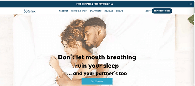
They kept things simple but powerful. The headline is clear. You don’t need a second look to grasp the meaning—it’s about better sleep.
It also taps into a deep emotion. The fear of hurting your loved ones.
#3. Display featured products prominently
Your homepage gives you an exceptional opportunity to showcase your top-selling products to new shoppers.
When featuring products on your homepage:
- Be selective – Don’t frontload your page with all your products. Pick your best products popular with shoppers. This enhances your chances of getting sales because the products are proven winners.
- Big product photos – Don’t make visitors squint their eyes to see your products—they should be apparent.
- Clickable photos – Clickable product photos allow shoppers to move quickly to products they’re interested in.
- Tidbits of copy – On your homepage you can’t write lengthy product descriptions so keep your copy short and sweet. Just enough to lure visitors to click for more details.
Leading furniture retailer Wayfair knows how to feature products:
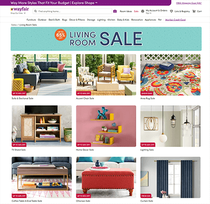
First, they use pronounced first-rate photos. Next, they include snippets of copy to tell visitors about discounts and pricing hints e.g. up to 60% off, from $25, etc. Also, they name the item underneath.
Finally, they don’t load too many products in one go so shoppers aren’t overwhelmed.
#4. Reel shoppers in through ratings and reviews
Customer reviews and ratings prove the authenticity of your products.
When people see high product ratings, they know your products are the real deal. Their jitters disappear. They shift their focus to picking the right product instead of asking themselves if your products are genuine.
Sportswear brand Fabletics uses customer reviews and ratings intelligently:
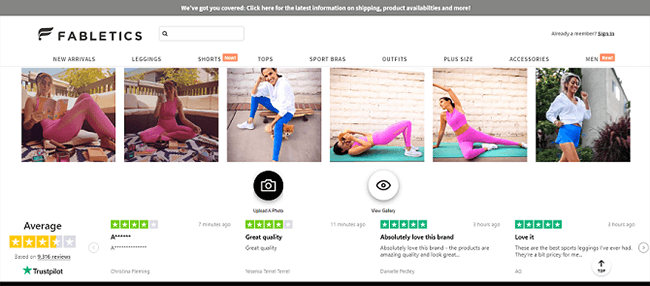
They included three types of social proof.
- Trustpilot rating
- Customer ratings
- Customer reviews
By piling up the proof, they make visitors trust them completely.
Testimonials are another effective form of social proof you can put on your store’s homepage. Social proof is also handy when crafting abandoned cart emails to bring back shoppers who left their carts before checking out.
Put shoppers at ease through testimonials, product ratings, and reviews.
#5. Tease shoppers with tantalizing product descriptions
While product photos do the heavy lifting to attract shoppers’ attention, your product descriptions should finish up the job for visitors to check out your products.
Obviously, on your homepage, you can’t give the full product details.
Use your descriptions to:
- Summarize – Give a brief overview of your products’ most powerful features and benefits.
- Tease – Arouse shoppers’ desire for your product by highlighting its fascinating elements.
- Intrigue – Spark curiosity in visitors’ minds by building a sense of mystery around your products.
- Benefits – Focus on your products’ major benefits, not features. Show visitors how they stand to gain from them.
Nail polish brand, Essie nailed it (pun intended):
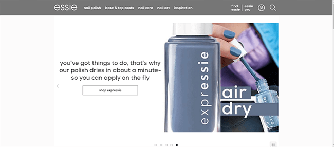
Instead of waxing long, they zeroed in on their polish’s biggest benefit—it dries up in a minute.
Simple. Powerful. Convincing.
That’s exactly what you want to do on your homepage. Parade your products’ star qualities. Hire a professional writer if you have to or learn how to do copywriting and write stellar descriptions.
Don’t forget to polish up your copy using Grammarly or any alternative tool.
#6. Have a prominent and distinct search bar
Quick question: why do people visit your store?
To shop, right?
Then make it easy for them to do so.
How?
Charm them with a gigantic search bar right on top of your eCommerce website. Make it so big that shoppers instinctively begin searching for what they want. You can see this trend in all leading online retail stores.
Check out Amazon’s search bar:
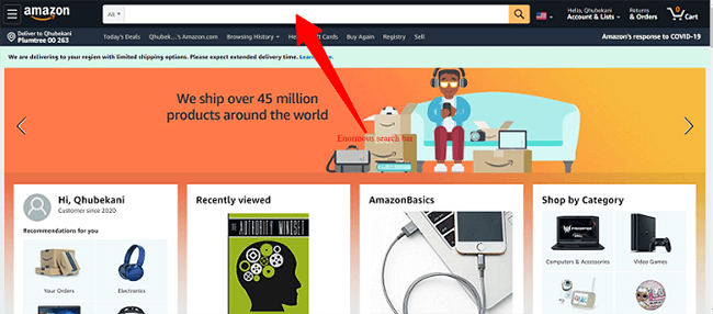
Huge. Dominating. Attention-getting.
That’s what you want. For your shoppers to get drawn into browsing for products straightaway.
Once they search, they inch closer to buying.
#7. Make them an offer they can’t resist
It’s hard for new customers to buy from you because they haven’t done business with you before.
To counter this tendency, present first-time visitors with a sumptuous offer that’ll lure them to make their inaugural purchase. Once you impress them with the brilliance of your product, they’ll come back for more. Research shows repeat customers are worth up to 10x as much as their first purchase.
So, do everything in your power to land the first sale.
There are several ways of making your special offer attractive:
- Massive discounts – Offer visitors a huge discount on a well-liked product.
- Loss leader – Offer shoppers a handy product at a cheap below-cost price to entice them to make the initial purchase.
- Scarcity – Use language that sparks a sense of urgency, so shoppers act promptly e.g. hurry while stocks last, only 3 items left, ends in [date], etc.
- Free shipping – Motivate shoppers to buy by offering them free shipping and returns management so they won’t have to worry about paying extra for the product to land on their door.
- Countdown timer – Don’t make your offer last forever. Include a countdown timer. When people see the clock ticking, the fear of missing out will kick in so they’ll buy straight away.
Mattress company Zoma has a tempting special offer:
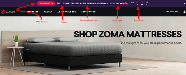
Their offer is alluring because it includes:
- A discount
- A coupon code
- A free shipping incentive
- A clear deadline
- A countdown timer
Shoppers are likely to buy for the first time because they have a lot to gain. And the offer is going away soon so they’ll act right away.
Sell more with an optimized homepage
Remember, your homepage is your store’s prominent front window.
Use it to attract visitors’ attention to your products. Make a good first impression and induce the click that’ll see them continue with their shopping journey. Tweak your page one element at a time until you find the best mix that maximizes conversions.
Coax visitors into browsers, browsers into buying customers.
